
Someone once said that you can’t judge a book by its cover, but we make judgements based on appearances all the time. There is the assumption that if you’ve made the effort to create quality packaging, the product inside will be of equal quality. And if it’s crappy on the outside, it will be crappy on the inside. Whether it’s people or product, that’s how we think.
Because I used to work as a graphic designer, I assumed that doing my own book covers would be easy. I was wrong. My biggest challenge had to do with ‘building my brand.’ I needed a look that would work for the books that I’d written AND for the books that I will write in the future. I played around with different looks for months before I came up with something I was happy with. I have to admit that another reason it took so long is my addiction to www.dreamstime.com. They offer over 1,500,000 copyright free graphics you can purchase at a reasonable price. You try them out before you purchase and that turned out to be a major time-suck for me because I was having too much fun to stop.
When I initially searched for my graphics, I wasn’t sure what I wanted, but I did know that I didn’t want the headless hero/heroine or naked male torso that you see on so many romance covers. I know these covers sell tons of books, but I just couldn’t make myself do it. Please don’t take offense if you’ve chosen this look. It’s my own personal hangup. I also can’t make myself drink hot chocolate out of a Santa cup with the top of his head lopped off… So should you follow current trends and make your cover look like others in your genre? As long as the cover reflects the genre, does it matter? (BTW-Your cover should reflect the genre or you’re going to piss people off.) I’m not qualified to answer this. There has to be market research on this, but so far, I haven’t found it.
I quickly learned that E-book covers are different from print book covers because the buying experience is different. Your potential customers aren’t wandering through a delightful, coffee-scented, brick and mortar book store at their leisure; they’re scrolling through their reading choices at warp speed and you’ve only got a second or two to get their interest. If your cover’s not up to snuff, potential customers have too many books to choose from to bother with yours. How do you make it look good? Whether you do it yourself or hire a pro, here are a few things I learned along the way:
Keep the background simple. On Amazon, E-book covers can get scaled down to the size of a postage stamp. Too much detail will make your cover look like bad modern art. Avoid white or very light-colored backgrounds–they don’t stand out. Not all fonts are legible when reduced down to fit that postage-stamp sized cover. Reduce the font by reducing your page size–not by picking a smaller font point size–to get an idea of what it will look like. Make sure the font doesn’t get lost in a similar background color. And there’s a plethora of fonts out there, so pick something interesting.
The outside dimensions of an E-book cover are at a ratio of approximately 6 to 10, and a minimum of 625 pixels on the shortest side and 1000 pixels on the longest side.
For best quality, your image would be 1563 pixels on the shortest side and 2500 pixels on the longest side. If you stray too far from those proportions, your cover will be stretched out or condensed to fit that ratio–not a professional look. Your cover also needs to be saved as a jpeg or tiff file before you can upload it. Once you’ve uploaded your cover, the postage -stamp sized image you see on the left may look fuzzy (I panicked when I saw this), but it will look fine on the Amazon website.
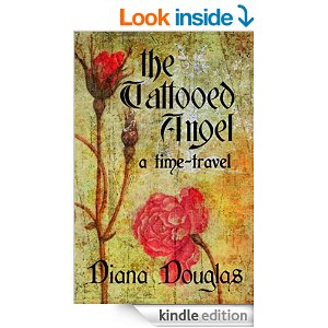
If you think that putting your name in large letters is egocentric, disabuse yourself of that notion. This one was tough for me. Accept that readers need to know who you are so they can buy your other books. I chose Bernard MT Bold for my name because it’s easy to read and should work well on any cover I do in the future. Keep your ‘brand’ in mind when you pick your fonts.
One last thought… Don’t over think it! You can’t tell your whole story with your cover. That’s what the inside is for.


Great advice, thanks, Diana!
You’re welcome!
Lots of good advice. I’m not to the cover stage yet, and haven’t even considered some of the very good points you’ve brought up. We laggers appreciate the trailblazing you’re doing!
I’m just drafting in the wake of those who have gone before me. I’ll leave the true trailblazing to others.
Thanks, this is really helpful. My past publishing experience has been in short non-fiction, and now that I’m trying to move into the full-length fiction neighborhood, I find myself dealing with so many new & confusing things. I intend to self-publish something, just to try it out if nothing else, but graphics isn’t my thing so I was stressing over this. I didn’t know where to start, and now I have some guidance. I really appreciate it.
Authors have to wear so many hats now, it can be overwhelming. I’m glad it helped.
Ditto what Char said – so glad you are getting it all figured out. It sounds like a hella lotta work. But your covers look great, Diana!
It was nerve-racking, but fun. The Dreamstime website is like a candy store to me.
Best line ever is your hot chocolate and santa claus mug!
>________________________________ >From: Diana Douglas >To: lockinga@yahoo.com >Sent: Friday, November 9, 2012 12:38 PM >Subject: [New post] Self-Publishing on Amazon #4 Judging a Book By Its Cover > >Diana Douglas posted: “Someone once said that you can’t judge a book by its cover, but�we make judgements based on appearances all the time. There is the assumption that if you’ve made the effort to create quality packaging, the product inside will be of equal quality. And if ” >
It just seems wrong.
This is one of the best posts I’ve ever read on self-publishing. I’m bookmarking it (pun not intended until I thought about it for a second).
– E
Thanks! I’m happy it worked for you. And the best puns are the ones you don’t intend to say.
What a great post Diana and I know it will be useful to writers who are thinking of self-publishing on Amazon … Tweeting this now.
Thanks!
Great post, extremely useful.
Thank you. 🙂
Glad you found it helpful. Thanks for dropping by.
Great pointers, Diana! Love everything about your covers, including all the words in between them. 🙂 Happy weekend!
Thank You! I’m looking forward to reading yours!
Thanks! I suck with book covers! The book cover and product description is what sells the book!
I checked out your book cover. It doesn’t suck!
This series is a godsend, Diana. Please, keep it coming. I’m nearing the end and all of this is SO helpful!
Thanks, Lorna!